Design and build company’s New Logo Builds on a Foundation of Excellence
![]() JHawk Builders wanted to better communicate to its clients the level of excellence that goes into each of their design and build products.
JHawk Builders wanted to better communicate to its clients the level of excellence that goes into each of their design and build products.
“People seemed to understand that we did construction projects, such as additions or remodels. However, the design aspect of our business was not always apparent to potential clients,” said Vice President Mark Fournier.
Owner Johnny Hawkes met with the team to review its current marketing materials. The website was not getting the desired traffic, and they needed guidance on a more effective marketing plan.
 The first recommendation was for a new brand. The existing logo featured a large hawk with talons open as if to attack clients. A streak of red ink underneath the hawk added to the impression that the company out to bleed its clients – definitely the wrong impression.
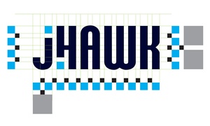
The new logo features a level of detail and precision that is the hallmark of the JHawk Builders team and the work they produce. Designer Thomas Roskelly painstakingly lined up each element of the logo so that each piece was precisely spaced and aligned.
 “I wanted to create a brand that conveys the attention to detail upon JHawk Builders has built its reputation as a design/build company,” said Roskelly.
“We enjoy working with Roskelly,” said Hawkes. “Tom and his team made the process very easy for us. They understood what we were trying to convey and delivered as promised.”
 About J. Hawk Builders: J. Hawk Builders, certified home builder and remodeler in Massachusetts and NH, is dedicated to providing quality craftsmanship. Fully licensed and insure, they pride themselves on raising the standards of quality building while keeping the customers desires and budget in mind.